How to center the div?
Today, Let’s take about everyone’s favorite topic and a beginner nightmare.
How do you center the element in HTML and CSS? You won’t need to know all kinds of tips and tricks to center the div, I will just show you two simple tips.
1) First method is to use the flex box.
<div class="center-the-child">
<!-- Can be any element here -->
<div>Hello I'm. div </div>
</div>
<style>
.center-the-child {
display: flex;
}
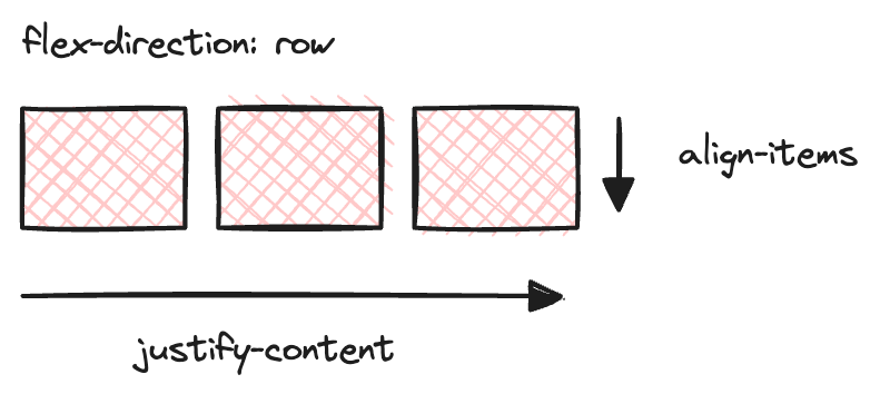
</style>Firstly, you need to change the display to be flex . Here comes two properties that you need to understand justify-content and align-items .
Let’s take a look at these image.
If the flex direction is horizontal (row), justify-content will be horizontal and align-items will be vertical.
If the flex direction is vertical (column), justify-content will be vertical and align-items will be horizontal.
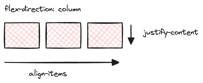
If you want to center the child elements in both vertical and horizontal, you can just use both properties to be center
.center-the-child {
	display: flex;
	justify-content: center;
	align-items: center;
}
There, you got the centered html element.

2) Okay okay, how about in position: absolute elements? Sure, this article will also cover that topic. That will be another tip that I’m going to show you.
Use 50% for positions and negative transform translate 50% to center the position: absolute element.
<div class="center-the-absolute-element">
	<div class="element">
		Here is the absolute div
	<div>
</div>.center-the-absolute-element {
position: relative;
width: 100%; // Not important
height: 500px; // Not important
}
.element {
position: absolute;
top: 50%;
left: 50%;
transform: translateX(-50%) translateY(-50%);
}WOW, it really got centered and even become responsive but what is the magic behind above code?
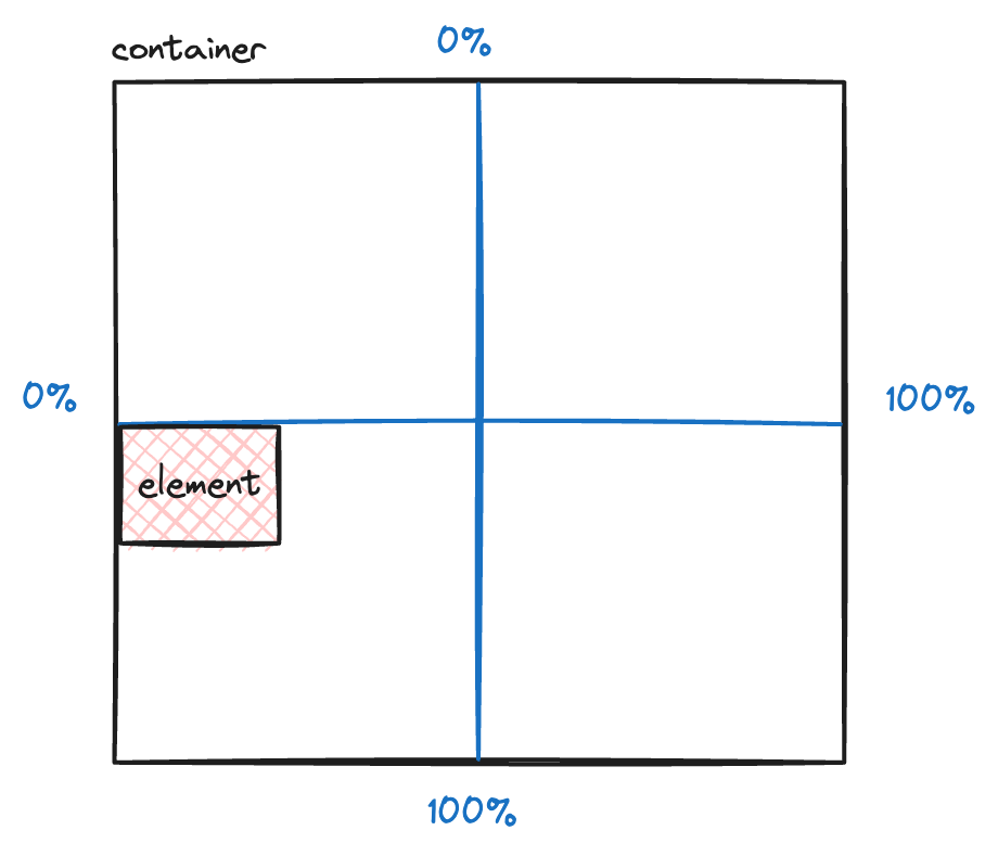
Firstly you need to understand the top , left , right and bottom .
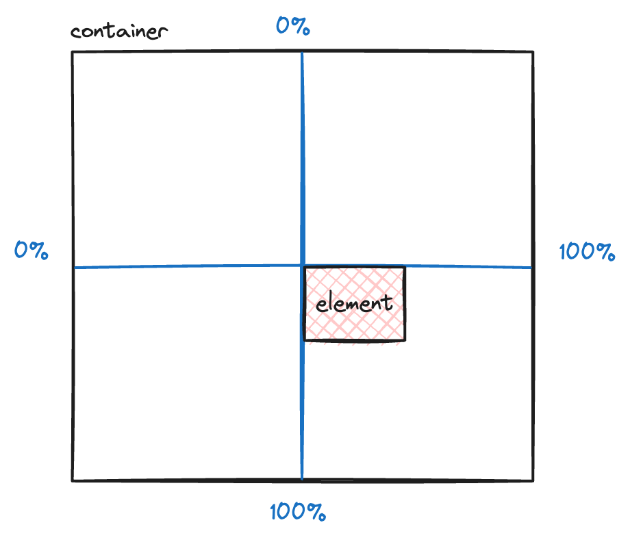
If you use the 50% in the top property, the element will become like this image.
if you use the 50% in the left property, the element will become like this image.
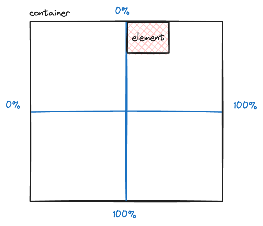
So it means that, it push 50% of the parent element size (width or height) to element in whatever the direction that you set. If you set top: 50% , it will push 50% of the parent element height to your element from the top, if you set left: 50% , it will push 50% of the parent element’s width to your element from left.
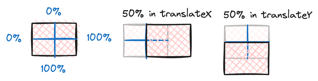
So we need to move back our element by 50% of the element width. Here comes transform: translate property.
Let’s take a look how percentage in translate works. translate in element work on the element width and height itself. So if you set -50% , it will set back the element to the left by 50% of the element width.
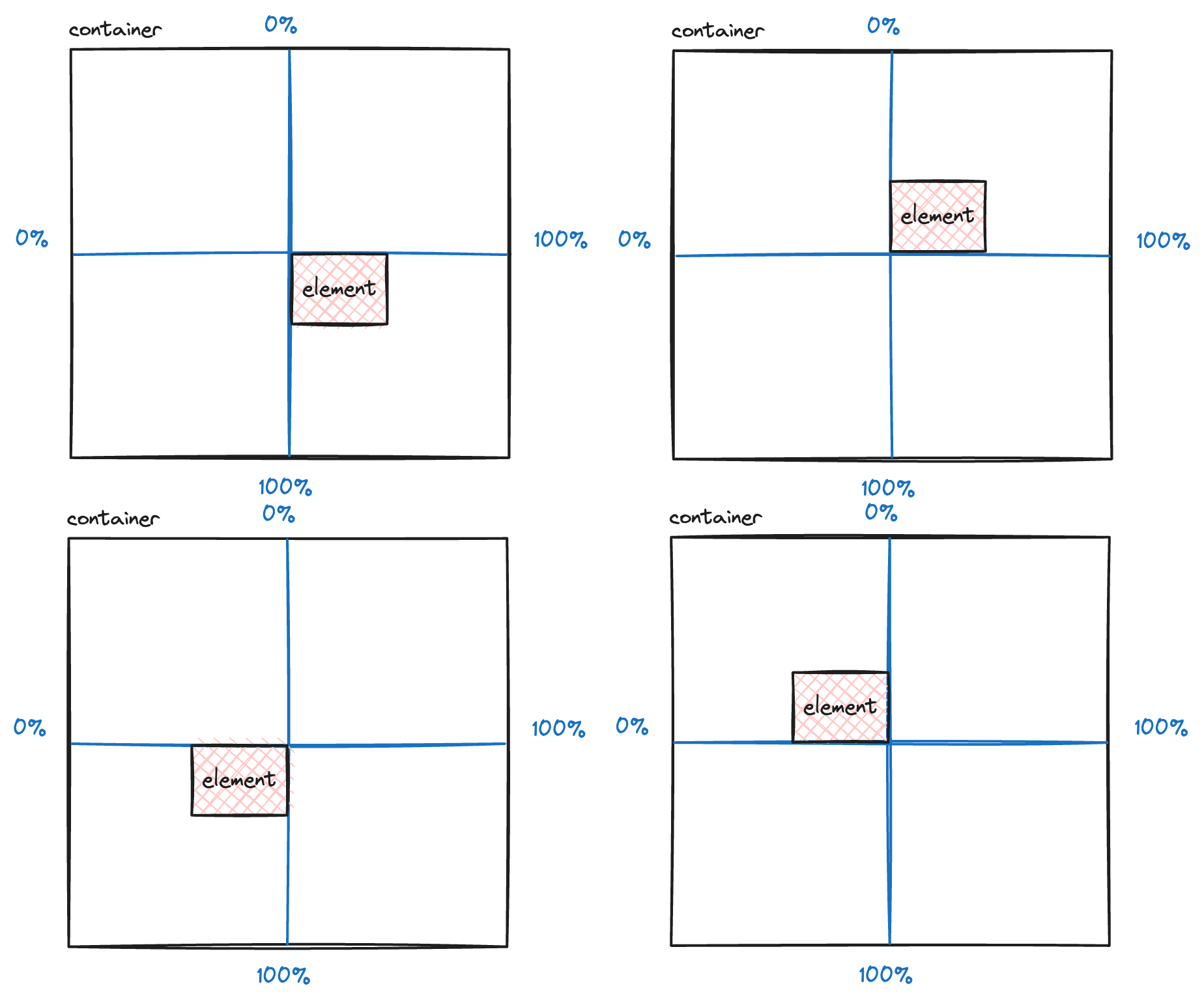
Here is the a game or challenge for you, keep top: 50% and left: 50% but try using transform: translate only in child element to create all these scenarios as if you’re going to use 50% in top , left , right and bottom properties.
Happy Hacking!